> For the complete documentation index, see [llms.txt](https://docs.cwicly.com/llms.txt). Markdown versions of documentation pages are available by appending `.md` to page URLs; this page is available as [Markdown](https://docs.cwicly.com/woocommerce/build-a-single-product-page.md).
# Build a Single Product Page
A single product page is a page that is designed to showcase a single product or service. This could be a Simple Product, a Variable Product, a Group Product or an external Product.
Generally a single product page contains the following:
* Product name
* Product description
* Product photo/Image
* Product price
* Variation swatches
* Add to Cart button
## Single Product Page
* Navigate to the WordPress dashboard.
* Open Cwicly.
* Open Themer and in the Templates tab click "Add Custom Template" button.
* This opens a "Custom Template" modal.
* Add required name.
* Click "Create".
### Visibility Conditions
* Find the new template in the Themer.
* Click "Visibility Conditions" icon.
* Click "+" to add a new Visibility Condition.

* In the "Single Product Page Visibility Conditions" modal:
* Set Visibility Condition to "Show if".
* Set Type to "Singular".
* Set Including to "Products".
* Set Product Type to "All".
* Click "X" to close Single Product Page Visibility Conditions modal.
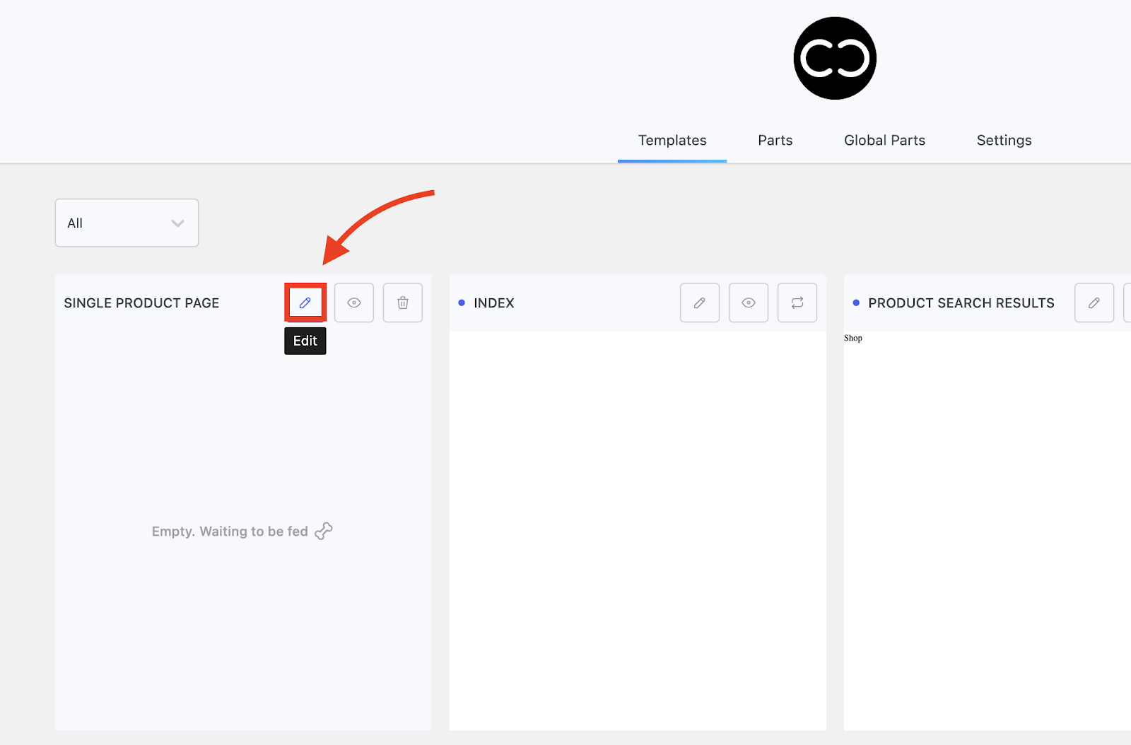
### Edit Single Product Page
* Click "Edit" icon to open template in the editor.
* This opens the Single Page Product page in the editor.
### Add Columns Block
* Let's add a Columns Block to contain all the information.
* Let's choose a 2 columns variety.
* With the Columns block selected, open the Grid Editor.
* Set 5 Fractions.
* Drag the Columns to form a 3 to 2 ratio as below.
* The First Column (Images) will contain the product Images and the Second Column (Info) will contain the product information.
* Set a 70px upper margin (Design tab, Margin and Padding tab).
### Images Column and Info Column
It is helpful to change the name of elements in the navigator to help you keep track of where you are.
Let's rename our Columns to Images Column and Info Column.
### Images Column
* With the Images Column selected, set Flex direction in the Primary tab.
### Images Repeater
With the Images Column selected, add a Repeater.
* Rename the Repeater to Images Repeater.
* In the Source tab of the Primary tab, set Source to Woo Gallery.
* Click Dynamic Preview and choose the product you wish to showcase in the dropdown.
{% hint style="info" %}
Until you have done this, you will not see anything.
{% endhint %}
* This could be a Simple Product, a Variable Product, a Group Product or an external Product.
* The type of Product being showcased depends on what you specify in the Dynamic Preview.
* The template we are creating can be used for all these different Product types. We will go through each one in turn.
* In the Dynamic preview dropdown, input the title of your Product and select it in the dropdown.
* You will notice that the Dynamic Preview icon is now orange in colour.
* The Repeater Placeholder will now be apparent.
* Click "+ Add Block".
* Add an Image block.
Now we need to set up the repeater.
* With the Images Repeater selected, in the Layout tab of the Primary tab, set Grid, Toggle on Auto grid.
* Set a 2px row and column gap.
* With the Images Repeater selected, open the Grid Editor.
* Set Fractions to 2.
* Click "X" at top right corner of Module 3 to remove.
* Click "X" to close Grid Editor.
* With Image block selected, set Source to Dynamic (Primary tab, Source tab).
* Set Data to WooCommerce.
* Set WordPress to WooCommerce Gallery.
* You should have something like this (with your own custom images).
### Info Column
* With the Info Column selected, set Layout to Flex, Column and Space between (Primary tab).
* With the Info Column selected, add a Div.
* Let's rename it the Info Div as it will contain most of our Product information.
* Let's style the Info Div.
* In the Margin and Padding tab (Primary tab) let's add a 50px padding all round.
* With the Info Div selected, in the Layout tab of the Design tab, open the Position tab.
* Set Position to "sticky".
* Set position as 100px top and bottom.
### Title Price
* With the the Info Div selected, add a Div.
Let's rename it "Title Price Div".
Let's set up some styling.
* In the Layout tab of the Primary tab, set Flex, Row, Centre, Space between.
* Add a 5px bottom Margin (Margin and Layout tab, Primary tab).
* With the Title Price Div selected, add a Heading.
### Post Title
Let's rename it Post Title.
* With the Post Title Heading selected, click Dynamic Values in the toolbar to open the Dynamic Content Modal.
* Set Source to WordPress.
* Set WordPress to Post Title.
You should see the title of your Single Product appear.
* Let's style the Title to make it stand out.
* In the Primary tab, Typography tab, set Font to Inter, Font Size to 1.2EM and Font Weight to 600px.
### Price Div
* Select the Title Price Div and add a Div.
* Let's rename it Price Div.
* Let's set up the layout of the Price Div.
* In the Primary tab, Layout tab, set Flex, Column, Flex end.
* With the Price Div selected, add a Paragraph.
* Let's rename the Paragraph Price.
* With the Price paragraph selected, click Dynamic Values in the toolbar.
* In the Dynamic Content modal, set Source to WooCommerce.
* Set WooCommerce to Price.
* Set Type to "Formatted Tax Currency".
* Let's Style the Price paragraph.
* In the Primary tab, Typography tab, set inter as the Font Style and a Font Weight of 600Px.
### "On Sale"
We need to add a condition to hide the normal price in case the article is "On Sale".
* Click the Conditions icon.
* Click "+" in the Show Conditions modal to add a Condition.
* Set Condition to "On Sale".
* Set Operator to "False".
* Click "+" to add a new Condition.
* In the Condition dropdown, select Product Type.
* Set Operator to "===".
While we are here and as we are building a Product Page for all types of Product, let's set Data to "Grouped product".
As the condition is false, if your product is a Grouped product it will not show.
* When you have finished adding your Conditions,
* Close the dialog by clicking the "X" icon.
* With the Price Div selected, add a Div which will contain Sale Price.
* Let's rename it "Sale Price Div".

* Style the Div as required. We have set Flex, 5px Column gap in the Layout tab of the Primary tab.
* Now let's set the conditions for when the Sale Price will appear.
* Click the Conditions icon to open the Conditions modal.
* Click the "+" icon in the Show Conditions modal to add a new Condition.

* Set Condition to "On Sale" in the dropdown.
* Set Operator to "true".
* Click "+" to add another condition to exclude Grouped Products from a sale.
* Set Condition to Product Type.
* Set Operator to "!=" (not equal to).
* Set Data to "Grouped product".
* Click "X" to close dialog.
### Barred Regular Price
* With Sale Price Div selected, add a Paragraph.
The Paragraph will contain the regular price with a line through as it is barred when the article is on sale.
Change Paragraph name to "Barred Regular Price".
* With the Barred Regular Price paragraph selected, click "Dynamic Values".
* Set Source to WooCommerce.
* Set WooCommerce to "Regular Price".
* Set Type to "Formatted Tax Currency".
* Style the Paragraph as required, such as Font type and weight (Primary tab, Typography tab).
### Sale Price
Now we need to add the Sale Price field.
* With Sale Price Div selected, add a Paragraph.
* Since the Paragraph will contain the Sale Price, let's rename it "Sale Price".

* With Sale Price paragraph selected, click "Dynamic Values" icon.
* Set Source to WooCommerce.
* Set WooCommerce to Sale Price.
* Set Type to "Formatted Tax Currency".
* Style the Sale Price paragraph, for example set Font type and weight (Primary, Typography tabs).
### SKU
Now let's add the SKU.
* With Info Div selected, add a Paragraph.
* Let's rename it "SKU".

* With SKU paragraph selected, open Dynamic Values.
* Set Source to WooCommerce.
* Set WooCommerce to SKU.
* Set Static Text to "Before".
* Style the SKU paragraph as required.
* Adjust Margin and Padding as required.
* In this case, we are adding a 80px lower Margin for spacing.
### Swatch Variations
We are now going to set up our Swatch Variations.
Since a Single Product does not have Swatch Variations, we will preview a Variable Product.
* Click Dynamic Preview.
{% content-ref url="/pages/IMbFN4PBUDQL7yWE3VTP" %}
[Variable](/woocommerce/create-a-product-type/variable.md)
{% endcontent-ref %}
* Input to select a Variable Product like the one that we set up together, in this example High Heeled Boots.
* With the Info Div selected, add a Repeater.
* With the Repeater selected, set Source to Variable Product.
* Rename the Repeater to Swatch Repeater.

* Style the Swatch Repeater.
* In the example, we have added a Flex layout, Column direction and 25px Row Gap.
We need to set the Conditions so that the Swatch Repeater only appears for Variable Product Types.
{% hint style="info" %}
Remember that the Single Product Page can be used for different Product Types.
{% endhint %}
* Open the Conditions panel.
* Click "+" to add a new Condition.

* Set Condition to Product Type.
* Set Operator to "===".
* Set Data to "Variable Product".
* Click "X" to Close Dialog.
* With the Swatch Repeater selected, click on the "+ Add Block" button.
* Let's add a Div.
* Let's rename it "Swatch Repeater Div" as it will contain all the Swatch information, such as labels and swatches.

* Style the Swatch Repeater Div layout as required.
* In this example Flex, Centre, Space between.
* With the Swatch Repeater Div selected, add a Paragraph which will show the Label titles.
* Let's rename the Paragraph "Variation Label".

* Open Dynamic Values in the Toolbar.
* Set source to WooCommerce.
* Set WooCommerce to Variation Label.
It should look like this with the Variation Labels of your chosen product.
* Style the Variation Label paragraph as required.
* In the example we have styled the Typography font, size and weight.
* With the Swatch Repeater Div selected, add a Div.
* This will contain all your Swatches.
* Let's rename it "Swatches Div".

### Colour Swatch
* With the Swatches Div selected, let's add a Div to contain the Colour Swatch.
* Let's name it "Colour Div".

* Style the Layout.
* In this example, Flex and 5px Column gap.
* With the Colour Div selected, add a Swatch block.
* Rename it "Colour Swatch".

* With the Colour Swatch selected, in the Primary tab, Settings tab.
* Set Attribute to Colour in dropdown.
{% hint style="info" %}
You won't see anything appear yet as you have to give the Swatch a size.
{% endhint %}
* So in the Sizing tab of the Design tab, set a 15px width and height as required.
* You will now be able to visualise the Colour Swatch.
* Let's style the Colour Swatch.
* With the Colour Swatch selected, in the Radius and Width tab in the Design tab, set an equal Radius of 20px.
### Material Swatch
* With the Swatches Div selected, add a Div.
* Let's rename it Material Div.

* Let's set Flex display and 5px Column gap. (Primary, Layout, Display tabs).
* With the Material Div selected, add a Swatch block to contain the Material Swatches.
* Let's rename it Material Swatch.

* With the Material Swatch block selected, in the Primary tab, Settings tab:
* Set Attribute to Image.
* You will not see anything until you set a size.
* In the Sizing tab of the Design tab, set width and height as required.
* In this example 50px height and width.
* With the Material Swatch selected, in the Design tab, Background tab, Sizing and Positioning tab:
* Set 50px left and 50px top position.
* Set Size to "Contain".
* Let's add some borders to Style our Material Swatch.
* With the Material Swatch selected, in the Radius and Width tab (Design tab, Borders tab),
* Set an equal Radius of 5px.
### Size Swatch
* With the Swatches Div selected, add a Div.
* Let's rename it Size Div.

* With the Size Div selected, add a Swatch block.
* Let's rename it Size Swatch.

* With the Size Swatch selected, in the Setting tab of the Primary tab:
* Set Attribute to Select.
* Let's style the Size Swatch.
* In this example, we have styled Font type, size and weight (Design tab, Typography tab).
* Let's set a Width of 100% (Design tab, Sizing tab).
* Let's add some Padding in the Spacing tab ( Design tab, Margin and Padding tab).
* In this example 2px upper and lower and 10px left and right Padding.
* Let's style the borders:
* In the Radius tab of the Borders tab of the Design tab,
* Add a 5px equal radius.
* Set Border to Solid, choose a Border colour as required.
* Set Border width to 1px all round.
### Grouped Product display
* Click Dynamic Preview and choose the [Grouped Product](/woocommerce/create-a-product-type/grouped.md) you wish to add in the dropdown.
* As we are now previewing a Grouped Products, the Swatch Variations of the Variable Product are no longer visible but we are able to use the same template (with the appropriate visibility conditions).
* With the Info Div Selected, add a Repeater.
* With the Repeater block selected, in the Source tab of the Primary tab, set Source to Grouped Product.
* Style the Repeater as required.
* In this example, in the Primary tab, Layout tab, set Flex, Column direction and a row gap of 10px.
* In the Design tab, Margin and Padding tab, Spacing tab, set a lower 50px Margin.
* Open the Conditions modal.
* Click "+" to add a new Condition.
* Set Condition to Product Type.
* Set Operator to "===".
* Set Data to "Grouped product".
* Click "X" to close Conditions Modal.
* Let's rename the Repeater "Grouped Product Repeater".
* With the Grouped Product Repeater block selected, add a Div.
* Let's rename it "Grouped Product Div".

* Style the Grouped Product Div as required.
* In this example, Flex, Row direction, Centre, Space between (Primary, Layout tab).
* With the Grouped Product Div selected, add a Div.
* Rename it Image, Icon, Quantity Div.

* Style the Div as required.
* In this example, Flex, Row, Centre, Space between.
* And a Column gap of 10px.
* With the Image, Icon, Quantity Div selected, let's add a Div.
* Rename it "Image, Quantity Div".

* Style as required.
* In this example, Flex, Centre, Column gap 8px (Primary, Layout tabs).
* With the Image, Quantity Div selected add an Image block.
* Rename it Grouped Product Image.

* With the Grouped Product Image selected, in the Primary tab, Source tab, set Source to Dynamic.
* Set Data to WordPress.
* Set WordPress to Featured Image.
* In the Size tab, set 90px Height and 70px width.
* Set Object fit to Cover.
* With the Image, Quantity Div selected add a Div.
* Rename it Quantity Div.

* Style as required.
* In this example, in the Layout tab, Flex, Row, Centre.
* In the Margin and Padding tab, set a 5px equal Padding.
* In the Design tab, Borders tab, Radius and Width tab, set Style as Solid.
* Set border Colour as required.
* Set Width to 1px all round.
* With the Quantity Div selected, add a Div.
* Rename it Step Down Icon.

* Style as required.
* In this example, with the Step Down Icon selected, in the Icon tab of the Primary tab,
* Set Size to 10px.
* Ensure that "Active" is toggled on.
* Click Icon to open the Icon Library and find a "-" Icon as required.
* With the Step Down Icon still selected, click Link to open the lInk modal.
* Toggle "Active" on.
* Set Type to Action.
* Set Action to Quantity Step Down.
* Click "X" to close Modal.
Now that we have made the Step Down Icon a link, we can tag it "button" because it is not a hyperlink to jump to another document. This means that it should be identified as a button because it is an action.
* With Step Down Icon selected, set Tag to "button" in the dropdown.
* With the Quantity Div selected, add an Input block.
* This will contain the number of articles.
* Let's rename it Quantity Input.

* Set Type to Item Quantity.
* Style the Quantity Input as required.
* In this example, in the Typography tab in the Design tab, set position to Centre.
* In the Layout tab, Design tab, set Display to "block".
* In the Sizing tab, set width to 20px as required.
* In the Radius and Width tab, Borders tab, set style to Solid.
* Remove width, set to an equal 0px.
* With the Quantity Div selected, add an Icon.
* Rename it Step Up Icon.

* In the Icon tab, toggle "Active" on.
* Set Size to 10px.
* Choose a Step Up "+" Icon from the library by Clicking the Icon logo in the Primary tab.
We need to be able to use the Step Up Icon as a button.
* With the Step Up Icon selected, click Link to open the Link Module.
* Toggle on "Active".
* Set Type to "Action".

* Set Action to "Quantity Step Up".

* Close Link Module by clicking "X" Close Dialog icon.

* In the Primary tab, set Tag to "button".
With Image, Icon,Quantity Div selected add a Paragraph.
* Rename it Product Title.

* With Product Title paragraph selected, click Dynamic Values to open the Dynamic Content modal.
* Set Source to WordPress in the dropdown.
* Set WordPress to Post Title.
* Style the Product Title paragraph as required.
* In this example, Font Type, Size and Weight. (Primary tab, Typography tab).
* With the Grouped Product Div selected add a Div.
* Let's rename it Price and Sale Div.

* Style the Price and Sale div as required.
* In this example, in the Layout tab we have set Flex, Column direction and Flex end.
* With the Prica and Sale Div selected, add a Paragraph.
* Rename it Grouped Product Price.

* With the Grouped Product Price paragraph selected, open Dynamic Values.
* Set Source to WooCommerce.
* Set WooCommerce to Price.
* Set Type to Formatted Tax Currency.
* Style the Grouped Product Price paragraph as required.
* In this example, Font Type, Size and Weight.
* Let's set Conditions for the Grouped Product Price paragraph.
* Open the Conditions Modal.
* Click "+" to add a Condition.

* Set Condition to "On Sale".
* Set Operator to "False".
* Click "+" to add a new Condition.
* Set Condition to Product Type.
* Set Operator to "===".
* Set Data to Grouped Product.
* Click "Close dialog" to close the Modal.
* With the Price and Sale Div selected, add a Div.
* Let's rename it "Sale Div".

* Let's style the Sale Div as required.
* In this example in the Layout tab, Flex, Column direction.
* Click to open the Conditions modal.
* Click "+" to add a Condition.

* Set Condition to "On Sale".
* Set Operator to "true".
* Click "+" to add another condition.
* Set Condition to "Product Type".
* Set Operator to "!=" (not equal to).
* Set Data to Grouped Product.
* Click "X" to close Conditions Modal.
* With the Sale Div selected, add a Paragraph.
* Rename it Regular Price.

* With the Regular Price paragraph selected, click Dynamic values to open Dynamic Content Modal.
* Set Source to WooCommerce.
* Set WooCommerce to Regular Price.
* Set Type to Formatted Tax Currency.
* Style the Regular Price paragraph as required.
* In this example, in the Typography tab we have styled the Font type, size and weight and Line through.
* With the Sale Div selected, add a Paragraph.
* Rename it Sale Price.

* With the Sale Price paragraph selected, open the Dynamic Values Modal.
* Set Source to WooCommerce.
* Set WooCommerce to Sale Price.
* Set Type to Formatted Tax Currency.
* Style the Sale Price paragraph as required.
* In this example, in the Typography tab, Font type, size and weight.
### Add to Cart button
We will now begin to style the "Add to Cart" button which will be displayed for Simple, Variable and Grouped projects.
{% hint style="info" %}
This button will not be visible for External Products.
{% endhint %}
* With the Info Div selected add a Div.
* Rename it "Add to Cart Button".

* Restyle the Add to cart Button.
* In this example: in the Primary tab, Layout tab: Flex, Row, Centre Centre with a column gap of 10px.
* In order for the button to stand out, choose a background colour.
* In this example Black (Primary tab, Colour tab).
* Add some Spacing as required.
* In this case, equal 10px padding and 20px lower Margin.
* Let's set up the Visibility Conditions for the "Add to Cart" button as discussed above.
* Click Conditions to Open.
* Set Condition to Product Type.
* Set Operator to "!=2 (not equal to).
* Set Data to "External/Affiliate product".
* Click "Close dialog" to close Conditions modal.
* With the "Add to Cart" button selected, click "Link" icon to open Link modal.
* Toggle "Active" on.
* Set Type to "Action".

* Set Action to "Add to Cart".

* Click "X" to close dialog.

* With the "Add to Cart Button" Div selected, add a Div.
* Let's rename it "Loading Animation Div" to provide a loading animation when a user clicks the button.

* You can now style the Loading Animation as required.
* In this example, in the Primary tab, let's set a 15px height and width in the Sizing tab.
* In the Borders tab, in the Design tab, open the Radius and Width tab.
* Set a 50px equal Radius.
* Choose a border colour and solid line.
* Set an equal width of 2px.
* Now let's set up the Loading Animation depending on your requirements.
* In the Borders tab, Design tab change the pseudo elements state to "before".
* Customise "Before" state as required.
* In this example, In the Radius and Width tab of the Borders tab (Design tab),
* Set a 50px equal radius, a solid equal border of 2px and a Border colour as required.
* Remaining in the "Before" state, in the Display tab in the Layout tab of the Design tab,
* Set "block" to ensure it is displayed as a block element.
* Remaining in the "before" state,
* In the Position tab of the Layout tab (Design tab).
* Set Position to "absolute".
* Still in the "before" state,
* Set Top -4px, Left -4px (Position tab, Layout tab, Design tab).
* In the Sizing tab (Design tab), set height and width to 15px.
In order to appear pseudo-elements have to have a content even if it is just an empty text string.
* So let's put quotation marks “” in the Pseudo content class in the Pseudo Classes tab in the Design tab.
* Return to "Normal" state.
* In the Effects tab, open the Animations tab.
* Set as required, in this example:
* Set duration to 0.8.
* Set Display to Linear in the dropdown.
* Set Name to "Spin" or as required.
* Set Iteration to "Infinite".
* We need to add a code snippet to create the Loading Animation.
* With the Loading Animation Div selected, open the Advanced tab and Custom CSS tab.
* Paste the code snippet below into the CSS code window as shown.
```
.blockclass::before {
border-right-color: transparent;
border-top-color: transparent;
border-bottom-color: transparent;
}
@keyframes spin {
100% {
transform: rotate(360deg);
}
}
```
* With the "Add to Cart Button" selected, add an Icon.
* In the Primary tab, Colours tab, choose required Icon colour.
* With the Icon selected, choose required Icon in the Icon tab of the Primary tab.
* In this case a Check mark.
* Make sure that "Active" is toggled on.
* Set required size, in this case 18 px.
* In the Display tab (Primary tac, Layout tab), set display to "block".
* Rename the Icon "Check Icon".

* With the "Add to Cart" button selected, add a Paragraph.
* Let's rename it "Add to cart Paragraph".

* Input "Add to cart".
* Style Typography colour as required (Primary tab, Colours tab, Text).
* Style Typography as required.
### Relative Styling for Loading Animation
We need to copy the Class of the Loading Animation Div so that we can set the relative styling for the Loading Animation and for the Checki icon to appear.
* With the Loading animation selected, select the Class in the Primary tab.
* Right click and click copy.
* With the "Add to Cart Button" div selected, in the Relative Styling in Design tab, click "+ Add New" to add a new Relative Style.
* Then click the "Rules" icon to open the Relative Styles modal.
* Input the Name of your Relative Style, in the example "Show loading animation".
* Leave Combinator unchanged.
* Set Selector Type to Class.
* Input Name, in the example "loading".
* Click to create.
* Click "After +", to add a new rule.
* Set Combinator to Descendant"" in the dropdown.
* Set Selector Type to Class in dropdown.
* Paste in the Class name of the Loading Animation div that we copied previously.
* Click "X" to Close dialog.
* Now, in the Design tab, click the relative style you have just created.
* In the example, "show loading animation".
* In the Layout tab, Display tab, set "block" display.
* With the "Check Icon" selected, right click Class.
* Copy the Class name.

* With the "Add to cart Button" div selected, in the Relative style tab (Design tab) click "+ Add New" to add a new Relative Style.
* Click "Rules" icon in the Relative Styling tab in the Design tab to open the Relative Styles modal.
* Input the Relative Style name. In this example "Show check icon".
* Leave Combinator unchanged.
* Set Selector Type to Class.
* Input class name. In this example "check"
* Click to create.
* Click "After +" to create a new rule.
* Set Combinator to Descendant "".
* Set Selector Type to Class.
* Input class of the Check Icon that we copied previously.
* Click "X" to Close dialog.
* Click the "Show check icon" Relative Style in the Relative Styling tab in the Design tab.
* Set Display to block in the Layout tab in the Design tab.
* Click "X" to close the "Show check icon" Relative Style.
* Click "+ Add New" in the Relative Styling in the Design tab.
* Input Relative Style name. In this example, "Disabled Style".
* Leave Combinator unchanged.
* Set Selector Type to Attribute.
* Set selector to "disabled".
* Click "X" to close dialog.
* It should now look something like this.
## External Product
Now we will show you how an External Product can be applied to a Single Product Page.
* Open Dynamic Preview and select the required External Product.
* With the Info Div selected, add a Button.
* Let's rename it "External Product Button".

* With the External Product Button selected, in the Primary tab, in the Colour tab, add a Background colour and Text colour as below.
* Style the Button typography as required.
* Set a Flex display and Centre.
* Set some spacing in the Margin and Padding tab of the Primary tab.
* In this example, 20px equal Padding, 20px lower Margin.
* In the Relative Styling tab of the Design tab, click "+ Add New" to open the Relative Styles modal.
* Input Name, in this case "Disabled style".
* Set Selector type to "Attribute".
* Input "disabled" to Selector window.
* Click "X" to close dialog.
* With the External Product Button still selected, in the Relative Styles tab of the Design tab,
* Click the style you have created to style the Relative Style.
* In this example "Disabled style".
* In the Design tab, open the Effects tab and then the General tab.
* Set Opacity and Cursor as required.
* In this example, Opacity is set to 0.2.
* Cursor is set to "Not Allowed".
* Witht External Product Button selected, open Link modal.
* Toggle "Active" on.
* Set Type to "Action".

* Set Action to "Add to Cart".

* Click "X" to close dialog.

* Click Conditions icon to open Conditions modal.
* Click "+" to add a Condition.

* Set Condition to "Product Type" in dropdown.
* Set Operator to "===" (equal to).
* Set Data to "External/Affiliate product" in dropdown.
* Click "X" to close dialog.
* This is how it should look now.
* The "Add to cart button" will not be visible on the Frontend as this is an external product.
* With the "Info Div" selected, add a Div.
* In the Layout tab (Primary tab)
* Let's rename it "Free Shipping Div".

* Add an Icon.
* With the Icon selected, in the Margin and Padding tab (Primary tab),
* Toggle Icon on.
* Set Size as required, in this example 18px.
* Click Icon to open the Icon Library.
* Choose required Icon.
* Rename the Icon "Free Shipping Icon".

* With the Free Shipping Div selected, add a Paragraph.
* Rename it "Free Shipping Paragraph".

* Input "Free shipping" and style Typography.
* In this example Font type, size and weight.
* With the Columns block selected, add a Columns block from the Block Inserter.
* This will place the new Columns block outside the other Columns Block.
* Choose the two column layout and click to select.
* With the Columns block selected, open the Grid Editor.
* Set Fractions to 3.
* Drag Fraction 1 to take up the additional module space as below.
* Click "X" to close dialog.
* Let's name the first Column "Description Column".

* With the Description Column selected, set a 90px equal Padding.
* With the Description Column selected, add a Heading.
* Rename it Description Heading.

* Input " Description" into the Description Heading.
* Set Heading to H2 and style Typography as required.
* In the Margin and Padding tab, set a bottom Margin of 10px.
* With the Description Column selected, add a Paragraph.
* Rename it "Description Paragraph".

* Open Dynamic Values.
* Set Source to WooCommerce.
* Set WooCommerce to Description.
* Let's Style the Description paragraph.
* In this example, in the Typography tab, Font Type, Size and Weight.
* And a row gap of 2px.
* In the Sizing tab of the Design tab, let's add a width of 50%.
* With the Column selected, in the Margin and Padding tab of the Primary tab, let's add a 50px equal Padding.
* Rename the Column "Composition Column".

* Copy Description Heading to clipboard.
* Select Description Column and Paste.
* Input Composition (in the place of the copied Description).
* Rename the copied Heading as "Composition Heading".

* With the Composition Column selected, add a Paragraph.
* Rename it "Composition Paragraph".

* With the Composition Paragraph selected, open Dynamic Values.
* Set Source to WooCommerce.
* Set WooCommerce to Short Description.
* Style the Composition Paragraph as required.
* In this example, in the Typography tab, Font type, Size and Weight.
Below is an example of what a Grouped Product page might look like.


