Documentation
HomeForumHelp
  • About Cwicly
  • Beginner's Guide
    • Install Cwicly
    • Getting Started
      • Overview
      • Settings
    • Edit and Manage your Site
    • The WordPress Dashboard
    • The Dashboard Menu
    • Site Editor
    • Create your Front Page
      • Front Page
      • Header
        • Header Template Part
        • Structure
      • Footer
        • Footer Template Part
        • Structure
  • ⚡Cwicly
    • Block ID
    • Breakpoints
    • Class
      • Global/Block Classes
    • Cloud Design Library
      • Create an Account
      • Overview of the Cloud Dashboard
      • Editor: Cloud Library
        • Access from the Editor
        • Add a Library
        • Switch between Libraries
        • Default Library
        • Download Library
        • Remove Library
        • Categories
          • All
          • Popular
          • Button
          • Composition
          • Decorative
          • Interactive
          • Layout
          • Media
          • Menu
          • Social
      • Design Blocks: Cloud Library
        • Search for a Design Block
        • Refresh
        • Add Design Block
        • Save Design to Library
        • Remove Design Block
      • Library Globals
        • Library: Global Styles
          • Library: Add Styles
          • Installation: Add Styles
          • Library: Style Settings
        • Library: Global Classes
          • Library: Add Classes
          • Installation: Add Classes
          • Library: Class Settings
        • Library: Global Stylesheets
          • Library: Add Stylesheet
          • Installation: Add Stylesheet
          • Library: Stylesheet Settings
        • Library: External Classes
          • Library: Add External Classes
          • Installation: Add External Classes
          • Library: External Classes Settings
      • Community Library
        • Save to Community Library
        • Download from Community Library
        • Remove from Community Library
        • Set Community as default
    • Colour Picker
      • Gradient Builder
    • Components
      • Components Library
      • Components Folders
      • Settings
      • Component Properties Modal
      • Properties (Add)
        • Text Property
        • Rich Text Property
        • List Property
        • Link Property
        • Image Property
        • Gallery Property
        • Video Property
        • Icon Property
        • Colour Property
        • Toggle Property
        • Number Property
        • Class Property
        • ID Property
        • Options Property
        • Conditions Property
        • Visibility Property
        • CSS Text Property
    • Copy/Paste
      • Block Styles
      • Classes & IDs
      • Dynamic Preview
      • Global Styles
      • Global Classes & Stylesheets
      • Blocks
    • CSS Grid
    • Dynamic Inserter
    • Font Manager
    • Navigator
    • Quick Inserter
    • Scaling
    • Smart Inserter
    • Span
    • Tag
  • ⛵Tailwind
    • Getting Started
      • About
      • Activate
      • Copy/Paste
      • Enable editing mode
      • Apply a Class
      • Pseudo state Management
      • Automatically Sync
        • Breakpoints
        • Colours
      • Shells
      • Custom Tailwind Configuration
      • Import Tailwind Plugins
  • 🖌️Themer
    • Themer
      • Templates
      • Parts
      • Fragments
    • Role Editor
      • User Role
      • Gutenberg Editor
      • Global Block Behaviour
      • Block Toolbar
      • Miscellaneous
      • Components
      • Code Block
      • Blocks
      • Post Types
      • Force iFrame
      • Client Canvas View
      • Help
      • User
  • 🌐Global Styles
    • Global Styles
      • Global Colours
        • Folders
        • Colour tab
        • Palette tab
        • Modifiers tab
          • Opacity
          • Lighten
          • Darken
          • Saturate
          • Desaturate
          • Spin
      • Dark Mode
      • Global Gradients
      • Global Typography
      • Global Block Typography
      • Theme Elements
      • Global Settings
        • Defaults
        • Backend
      • Remove Gutenberg Global Styles
    • Global Classes & Stylesheets
      • Global Classes
      • Global Stylesheets
      • External Classes
  • 🎨Design
    • Background
      • Background Colors
      • Background Source
      • Sizing & Positioning
      • Styling
    • Typography
      • Typography
      • Rem conversion
      • Global Typography
      • Text Align
      • Font Family
      • Font Size
      • Font Weight
      • Spacing
      • Line Height
      • Style
      • Decoration
      • Transform
      • White Space
      • Overflow Wrap
      • Word Break
      • Word Spacing
      • Axes
      • Text Colour
      • Link Colour
    • Fluid Values
    • Layout
      • Display
      • Visual
      • Position
    • Sizing
      • Height
      • Width
    • Margin & Padding
    • Borders
      • Border
      • Shadows
      • Outline
    • Effects
      • General
      • Transitions
      • Animations
      • Filters
      • Text Shadow
      • Tilter
      • Separators
    • Transforms
    • Pseudo Classes/Elements
    • Relative Styling
  • 🎓Advanced
    • Custom CSS
    • Quick Code
    • Scrolling
      • Animate On Scroll
      • Scroll Direction
    • Attributes
    • Tooltip
      • Source
      • Theme
        • Custom Theme
  • 👆Interactions
    • Visibility Conditions
      • Blocks
      • Themer
    • Link
      • Link Source
      • Link Action
    • Interactions
      • Trigger
      • Actions
    • Hover Animation
    • Dynamic Slider
      • Settings Tab
  • 🖥️Editor
    • Inserter Panel
    • Quick Insert
    • Block Inspector
    • Primary Tab
    • Design Tab
    • Advanced Tab
    • Responsive Selector
  • 🔧Blocks
    • Accordions
    • Accordion
      • Basics
      • Settings
      • Colours
      • Layout
      • Typography
      • Margin and Padding
    • Button
      • Add
      • Icon
    • Code
      • Enable/Disable
      • Add
      • Languages
      • Settings
    • Columns
      • Basics
      • Add
      • Settings
      • Grid Editor
        • Auto Grid
        • Auto Template
    • Column
    • Container
    • Div
    • Filter
      • Basics
      • Filter Editor
      • Create a Filter
      • Style a Filter (example)
    • Fragment
    • Gallery
      • Filter
      • Source
      • Settings
      • Text
      • Image Style
    • Heading
    • Hook
    • Icon
    • Image
      • Source
      • Size
      • Settings
      • Hover Animation
    • Input
      • Input Settings
    • List
      • List Types
      • Settings
      • Icon
    • Maps
      • Settings
      • Size
      • Style
      • Overlay Layout
      • Colours
    • Menu
      • Settings
      • Main Menu
      • Sub Menu
      • Items
    • Modal
      • Modal Style
      • Settings
      • Trigger
      • Animation
    • Nav
      • Nav Block Settings and Styles
      • Nav Items Block
      • Nav Dropdown Block
      • Nav Link
      • Custom Dropdown Block
      • Nav Menu
    • Post Content
    • Paragraph
    • Popover
    • Query
      • Query Settings
      • Query Editor
        • Posts
        • Terms
        • Users
        • Comments
    • Query Template
      • Layout
      • Grid editor
    • Repeater
      • Nested Repeater
    • Section
    • Slider
      • Settings
      • Navigation
      • Dots
    • Slide
    • Styler
    • SVG Block
    • Tab List
      • Tab
    • Tab Contents
      • Tab Content
    • Taxonomy Terms
    • Video
      • Source
      • Settings
      • Div Overlay
  • ⚙️Settings
    • Settings
    • License
    • Icon Collections
    • Font Sets
    • Google Maps API
    • Advanced Settings
    • Regeneration
    • WooCommerce
  • 🛒WooCommerce
    • Archive Page
    • Attributes
      • Colour Type
      • Image Type
    • Cart
    • Product Variations
    • Create a Product Type
      • Simple
      • Variable
        • Create Attributes
      • Grouped
      • External
    • Build a Single Product Page
    • Dynamic Content
    • Link
  • 🗃️Miscellaneous
    • Blocks Specifics
    • Icon Selector
    • Trailing Slash
    • Units
      • Default Units
    • Code Snippets
    • Shortcuts
    • Actions
    • Filters
    • Browser Console
  • 🔗Resources
    • Changelog
    • Roadmap
    • Forum
Powered by GitBook
On this page
  • Add a Link
  • Activate Link
  • Link Type
  • URL
  • Link Action
  • Link Source
  • Link Action

Was this helpful?

  1. Interactions

Link

Last updated 1 year ago

Was this helpful?

The Link properties encapsulate all the different settings that will allow you to control and enable a link for a specific block.

Once activated, it doesn’t wrap your block in a link wrapper, but instead transforms it in a link, allowing it to conserve the characteristics of the initial block.

The following blocks support the Link feature:

  • Button

  • Div

  • Paragraph

  • Heading

  • Icon

  • Column

  • Slide

  • List

Add a Link

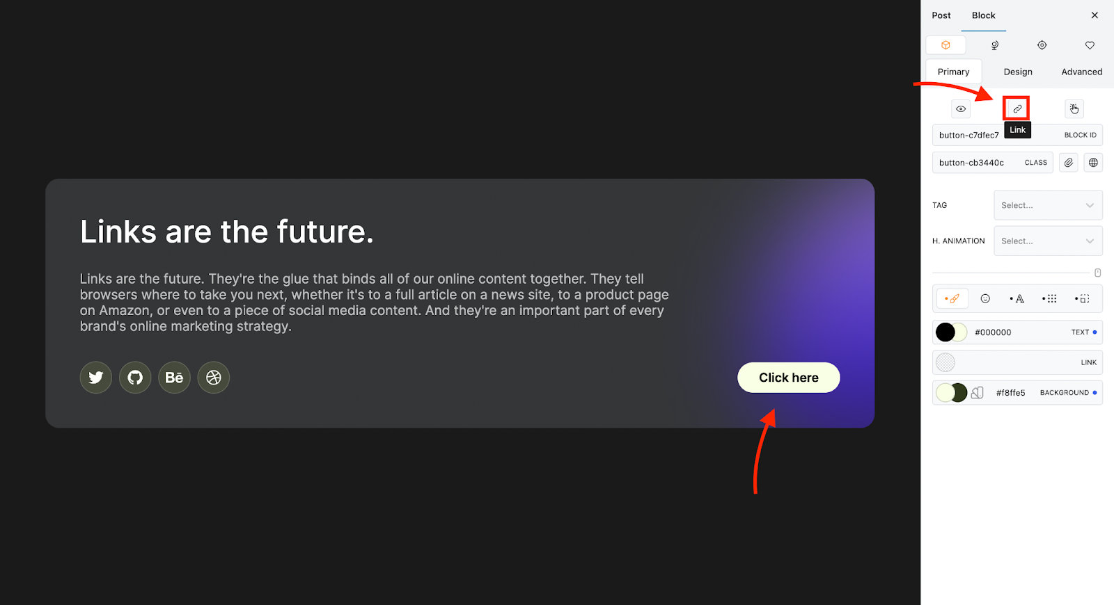
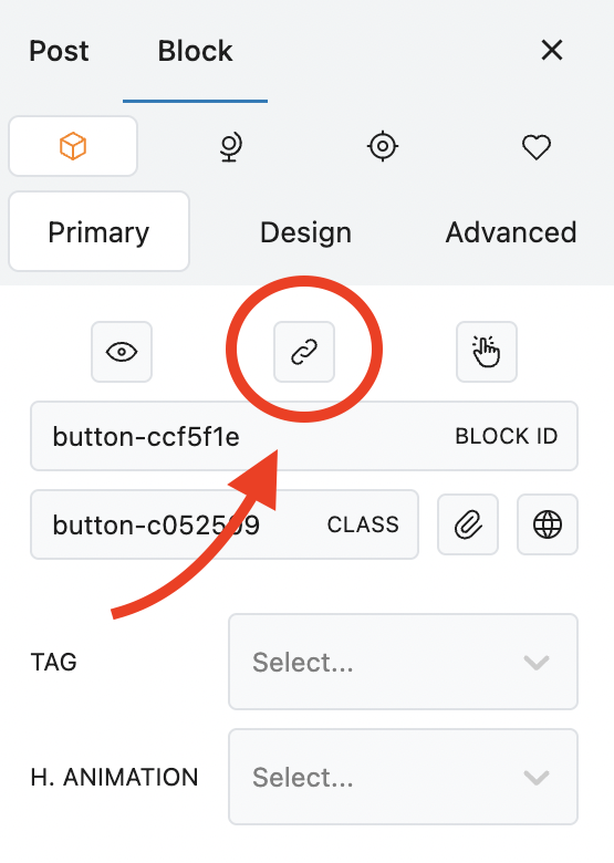
  • Select the block to which you wish to add a link.

  • Navigate to the Primary tab of the Block Inspector

  • Find the Link icon.

  • Click to open the Link panel.
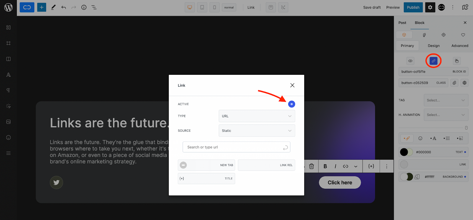
Activate Link

  • Links are not active unless "Active" is toggled on.

Link Type

The Type property allows you to define the link as a URL or an action.

  • Links can be either a URL (Uniform Resource Locator or web address) or an Action.
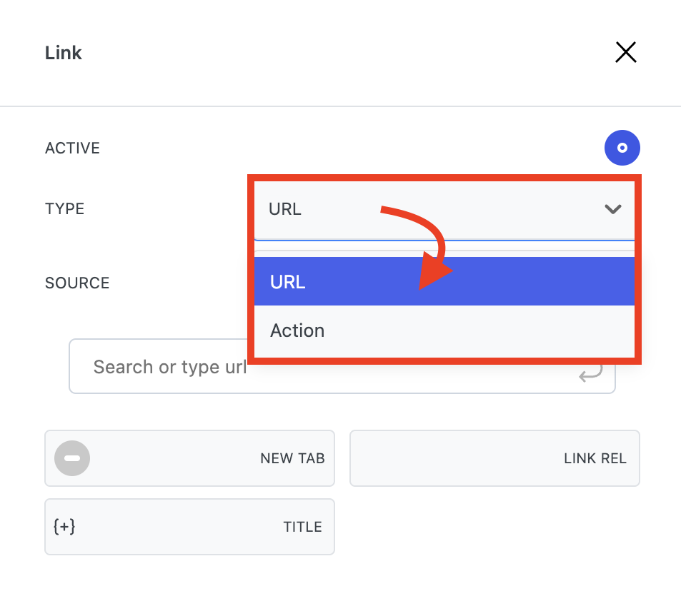
URL

When clicked, ÚRL will link to a chosen URL. This can be either static or dynamic.

Link Action

When the Action property is selected, a Link, when clicked, will perform a chosen action.

Modify
  1. Select a block

  2. Open the Block Inspector

  3. Navigate to the Primary tab

  4. Find the Define as link property

  5. Find the Link Type property

  6. Select the desired value from the dropdown

Link Source

The Link Source property gives you the option to choose whether the URL source should be static or dynamic.

Link Action

The Link Action property gives you the option to choose between different actions that will be performed when a user clicks on the Link Wrapper.

👆
Link Source
Link Action
Getting Started - Links