> For the complete documentation index, see [llms.txt](https://docs.cwicly.com/llms.txt). Markdown versions of documentation pages are available by appending `.md` to page URLs; this page is available as [Markdown](https://docs.cwicly.com/blocks/modal.md).
# Modal
The `modal` block is a popup or dialog that appears over a page's content. It can be interacted with to exit it and return to the page.
## Basics
The `modal` block is essentially an overlay background and a `div` block.
The `modal` block will appear inline (beneath or above) when using the editor so that editing is easy and intuitive. On the front-end, the `modal` block will be rendered overlaying the other elements of the page.
To hide/reveal the `modal` block, simply toggle the "eye" icon in the Cwicly Navigator.
{% hint style="danger" %}
It is not advisable to add a `modal` block inside a parent block as this will create errors.
{% endhint %}
Add a modal
1. Click on the ➕ icon to open the Inserter Panel
2. Search for the `modal` block
3. Click on the `modal` block to insert it into your page
## Modal Menu
You need to add a Menu to your modal block before you style it.
With the Modal block selected, add a Menu from the Quick Inserter.
{% content-ref url="/pages/-MS3HTH15FnK2YqG3DQV" %}
[Menu](/blocks/menu.md)
{% endcontent-ref %}
{% embed url="" %}
How to - Modal Pop Up
{% endembed %}
## Colours
The Modal Colours tab allows you to customise the text, links and background of your modal.
Modify colours
1. Click on the ➕ icon to open the Inserter Panel
2. Search for the `modal` block
3. Click on the `modal` block to insert it into your page
4. Find Colours Tab
5. Open to modify text, links and background colours
Reset colours
1. Click on the ➕ icon to open the Inserter Panel
2. Search for the `modal` block
3. Click on the `modal` block to insert it into your page
4. Find Colours Tab
5. Click dot(s) to reset modal colours
## Inner Layout
The Modal Inner Layout tab allows you to modify your modal inner layout and includes: display, direction, position, behaviour, text size, spacing.
Modify inner layout
1. Click on the ➕ icon to open the Inserter Panel
2. Search for the `modal` block
3. Click on the `modal` block to insert it into your page
4. Find Layout Tab
5. Open to modify inner layout (display, direction, position, behaviour, text size, spacing)
Reset inner layout
1. Click on the ➕ icon to open the Inserter Panel
2. Search for the `modal` block
3. Click on the `modal` block to insert it into your page
4. Find Layout Tab
5. Click dot(s) to reset
{% content-ref url="/pages/-MS3GcvF\_fB9BagGqxUY" %}
[Layout](/design/layout.md)
{% endcontent-ref %}
## Modal Style
The Modal Style properties allow you to customise the look and feel of the modal window, for example: Overlay colour, Height, Width, Position.
{% content-ref url="/pages/nyGV44XXmdeM9Ynrz6MU" %}
[Modal Style](/blocks/modal/modal-style.md)
{% endcontent-ref %}
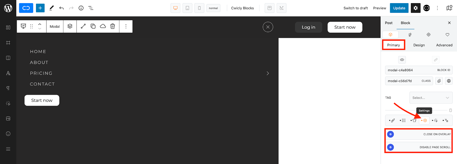
## Settings
The Modal Settings properties allow you to customise the interactions users can have with the Modal.
{% content-ref url="/pages/uEig60c1Qb3RDZpx8H3k" %}
[Settings](/blocks/modal/settings.md)
{% endcontent-ref %}
## Trigger
The modal trigger tab allows you to set the modal's block trigger settings.
{% content-ref url="/pages/bKCHfuM7tnN9DjzuHF80" %}
[Trigger](/blocks/modal/trigger.md)
{% endcontent-ref %}
## Animation
Animate the modal block's appearance and disappearance, with specific transition durations.
{% content-ref url="/pages/tusEunnuO0X18t2I1zVr" %}
[Animation](/blocks/modal/animation.md)
{% endcontent-ref %}