# Global Styles
Global Styles are CSS styles that are applied to elements throughout the entire website, rather than being applied only to specific elements on individual pages.
These styles can include things like default font, font size, and font colour, default background colour or image, elements such as buttons or links and the default alignment of text and other elements.
Global Styles help to ensure that the website has a consistent look and feel, and it can also make it easier to make changes to the design of the website, because the changes will be applied automatically to all the pages on the site.
The Global Styles option adds an interface to apply styling when in the Gutenberg editor.
{% hint style="info" %}
Global Styles are automatically saved when you save or publish a post or page.
{% endhint %}
{% hint style="info" %}
If you wish to only save the Global Styles, click on Save Settings in the Global Styles tab.
{% endhint %}
Modify
1. Navigate and click the Cwicly Global Styles menu tab
2. Modify the desired property.
{% embed url="" %}
How To - Global Styles
{% endembed %}
## Style Variations
{% hint style="info" %}
There are 3 Style Variations (Style 1, Style 2, Style 3).
{% endhint %}
Style Variations allow you to switch between user defined Global Style Properties in an instant. This gives you the flexibility to choose the best combination of colour and typography for your site.
{% embed url="" %}
Select
1. Navigate to the Global Styles panel
2. Select the desired style
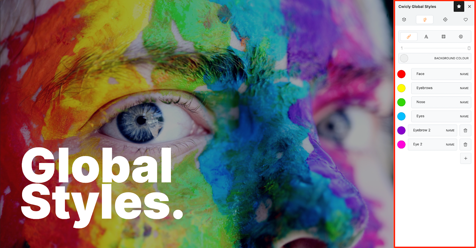
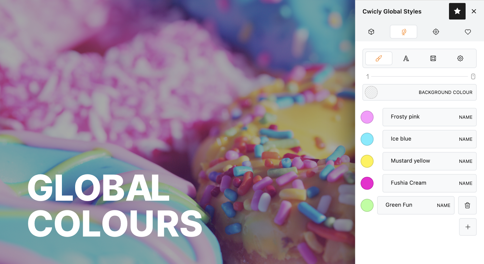
## Global Colours
The Global Colours group allows you to add global colors to your website. So you can create a unified color palette across your entire website, but also perform adjustments across the board.
{% content-ref url="/pages/SzUW0otG0RkFll297OGR" %}
[Global Colours](/global-styles/global-styles/global-colours.md)
{% endcontent-ref %}
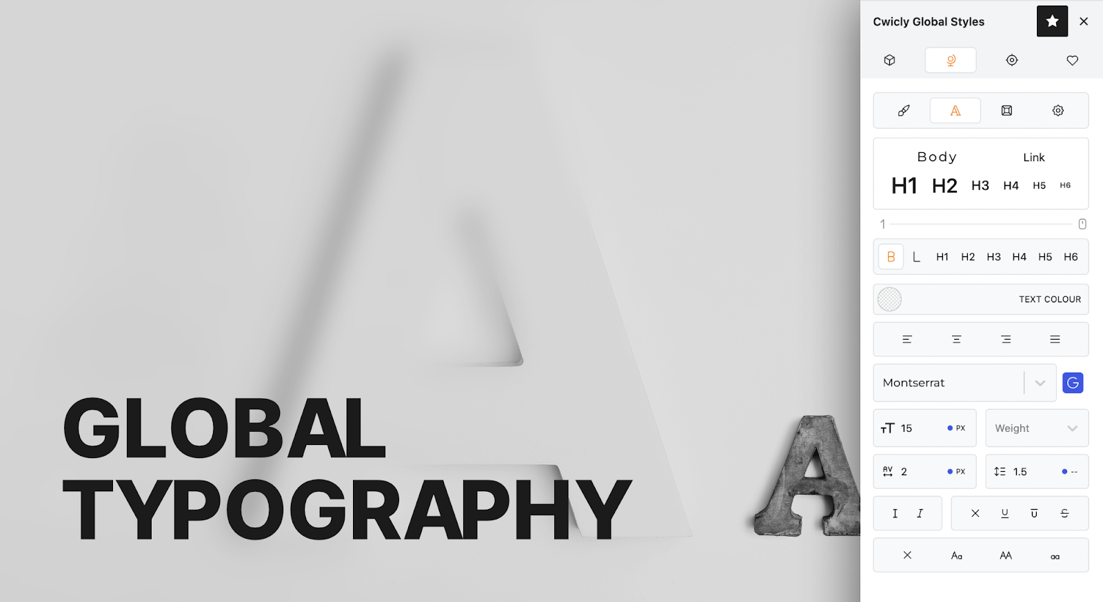
## Global Typography
The Global Typography group allows you to apply Global Typographic Styles across your website for common elements (body text, links, headings etc.).
{% content-ref url="/pages/FsWU6ViyOXDRWkQYMkg5" %}
[Global Typography](/global-styles/global-styles/global-typography.md)
{% endcontent-ref %}
## Global Block Typography
The Global Block Typography panel allows you to add global block typography that can be added on a per block basis, but also perform adjustments across the board.
{% content-ref url="/pages/S16Pi1goq1K81ZZE6kTE" %}
[Global Block Typography](/global-styles/global-styles/global-block-typography.md)
{% endcontent-ref %}
## Theme Elements
Allows you to apply styling to website elements on a global level.
{% content-ref url="/pages/5MrtnRDDfT2JzylCaq6R" %}
[Theme Elements](/global-styles/global-styles/theme-elements.md)
{% endcontent-ref %}
## Settings
Allows you to customise various Cwicly settings.
{% content-ref url="/pages/Vmzav64gRBCdsktEz7Mk" %}
[Global Settings](/global-styles/global-styles/global-settings.md)
{% endcontent-ref %}
---
# Agent Instructions: Querying This Documentation
If you need additional information that is not directly available in this page, you can query the documentation dynamically by asking a question.
Perform an HTTP GET request on the current page URL with the `ask` query parameter:
```
GET https://docs.cwicly.com/global-styles/global-styles.md?ask=
```
The question should be specific, self-contained, and written in natural language.
The response will contain a direct answer to the question and relevant excerpts and sources from the documentation.
Use this mechanism when the answer is not explicitly present in the current page, you need clarification or additional context, or you want to retrieve related documentation sections.