> For the complete documentation index, see [llms.txt](https://docs.cwicly.com/llms.txt). Markdown versions of documentation pages are available by appending `.md` to page URLs; this page is available as [Markdown](https://docs.cwicly.com/interactions/dynamic-slider/settings-tab.md).
# Settings Tab
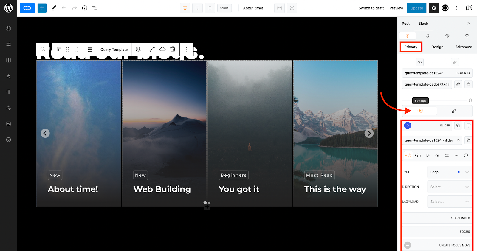
The Settings tab allows you to set up a slider inside your `query template`, `repeater` or `taxonomy query`.
When the Slider is toggled on, a Slider tab will open and give you access to a selection of tabs to help you set up your Slider, such as general, layout, play, interaction, arrows, pagination, accessibility.
For a detailed description of Slider options, please visit
## General

The General tab allows you to adjust settings such as type (slide, loop, fade), direction (left to right, right to left, vertical), lazyload (false, true,nearby, sequential), start index, focus, update focus move.
For a detailed description of Slider options, please visit
## Layout

The layout tab allows you to set parameters for your layout, such as number of slides per page, number of slides per move, padding, gap, height, width, fixed height, fixed width, height ration, toggle auto height, toggle auto width.
For a detailed description of Slider options, please visit
## Play

The play tab allows you to set options for how you want the slider to play, such as transition, easing, autoplay (false, true, pause), rewind (false, true).
For a detailed description of Slider options, please visit
## Interaction

The interaction tab gives you access to the way the user interacts with the slider, such as drag (false, true, free) min. drag threshold, snap (false, true), keyboard (false, true, global, focused), wheel (false, true), min. wheel threshold, wheel sleep, release wheel (false, true).
For a detailed description of Slider options, please visit
## Arrows

The Arrows tab allows you to style the navigation arrows but also to set specific settings for arrow behaviour, such as arrows, styling, snap.
### Arrows
The arrows property allows you to toggle navigation icons off by selecting.false in the Arrows dropdown.

To enable arrows, choose true in the Arrows dropdown (default).
This will open up additional options for styling your arrow icons.

To reset, click the blue dot.
### Styling
The styling property allows you to add styles to your navigation icons (arrows) using slider specific classes, "Arrows +" and "Arrows Hover +".

If you click on one of the Styling + buttons, a slider specific class will be created.

If you now click on the new slider specific class, you will be able to style the Navigation Icons (Arrows) or Navigation Hover.
 
### Previous (Left) Arrow
The previous arrow property allows you to show/hide the previous (left) navigation icon and to select an alternative icon.

### Right Arrow
The right arrow property allows you to show/hide the right navigation icon and to select an alternative icon if desired.

### Snap
The snap property snaps to the closest slide when you drag.

### Pagination
The pagination property allows you to modify parameters in the pages of your dynamic slider such as whether pages are visible or not, page wrapper, page number and active page.

#### Pagination
The Pagination dropdown allows you to choose whether to have pagination visible or not on your dynamic slider (false, true).
To have pagination, select "true" in the dropdown.

#### Styling
The styling property allows you to add slider specific classes to your pagination, such as "Page Wrapper", "Page Item", "Page Item Active".

* Select the slider specific class you require to add it to the class of the parent block.

* When you click on the slide specific class you want to modify, an editing panel will open up where you can adjust styling options as below.
 
#### Keyboard
{% hint style="info" %}
Before setting up keyboard access to pagination, remember to enable Keyboard in the Interaction panel
{% endhint %}

When enabled in the pagination tab, (true in dropdown) keyboard will allow you to control slider pagination from the keyboard on the front end.

#### Direction
The direction property allows you to select the direction in which you wish to control your dynamic slider from the keyboard on the frontend (left to right, right to left, vertical).

### Accessibility
The accessibility property allows you to add an accessibility label (the thing it labels) or labelled by (references other elements) to your dynamic slider.

## Copy and Paste Icons
Next to the Slider toggle you will find Copy and Paste Icons.
### Copy
The copy icon allows you to copy the slider options you have set up so that you can transfer them to another dynamic slider elsewhere.

### Paste
The paste icon allows you to paste slider options copied from another dynamic slider.

### Copy Slider ID
The Copy Slider ID icon allows you to copy the ID of your slider so that you can paste it somewhere else on the page.

---
# Agent Instructions
This documentation is published with GitBook. GitBook is the documentation platform designed so that both humans and AI agents can read, navigate, and reason over technical content effectively. Learn more at gitbook.com.
## Querying This Documentation
If you need additional information that is not directly available in this page, you can query the documentation dynamically by asking a question.
Perform an HTTP GET request on the current page URL with the `ask` query parameter, and the optional `goal` query parameter:
```
GET https://docs.cwicly.com/interactions/dynamic-slider/settings-tab.md?ask=&goal=
```
`ask` is the immediate question: it should be specific, self-contained, and written in natural language.
`goal` is optional and describes the broader end goal you are ultimately trying to accomplish on behalf of the user. GitBook uses it to tailor the answer towards what is most useful for that goal.
The response will contain a direct answer to the question and relevant excerpts and sources from the documentation.
Use this mechanism when the answer is not explicitly present in the current page, you need clarification or additional context, or you want to retrieve related documentation sections.