# Fluid Values

Today's users require that your website content be as responsive as possible.&#x20;

Ideally, your website content should flow freely across all screen resolutions and sizes so that it looks great on all devices.

This is why Cwicly has introduced fluid values so that you can set your defaults between which your content will adapt to different screen sizes effortlessly and without you having to do anything each and every time.

This will save you time, resources and effort.

## Fluid Typography

Fluid typography allows you to choose how your font properties (size, line height) scale fluidly to different screen sizes automatically within the limits you set.

<figure><img src="https://lh5.googleusercontent.com/456BXUeIDQ6NJHaCz6i5c4SvfX0H6eSnS9ioz-l9G5Hby13Bs5SOdjDjFLCHARSs2fQTDUEfwhjV6cGE6ZX9LJze1reaNhEYLcei6gIqP_8gRDMvLU_E9c34FoOcDFWnyZA_G4kDAc8Rvc84Cnrctxg4XoSEDU8QSjGfzN6cl0cT8P-_B8BApwU8V_TysA" alt=""><figcaption></figcaption></figure>

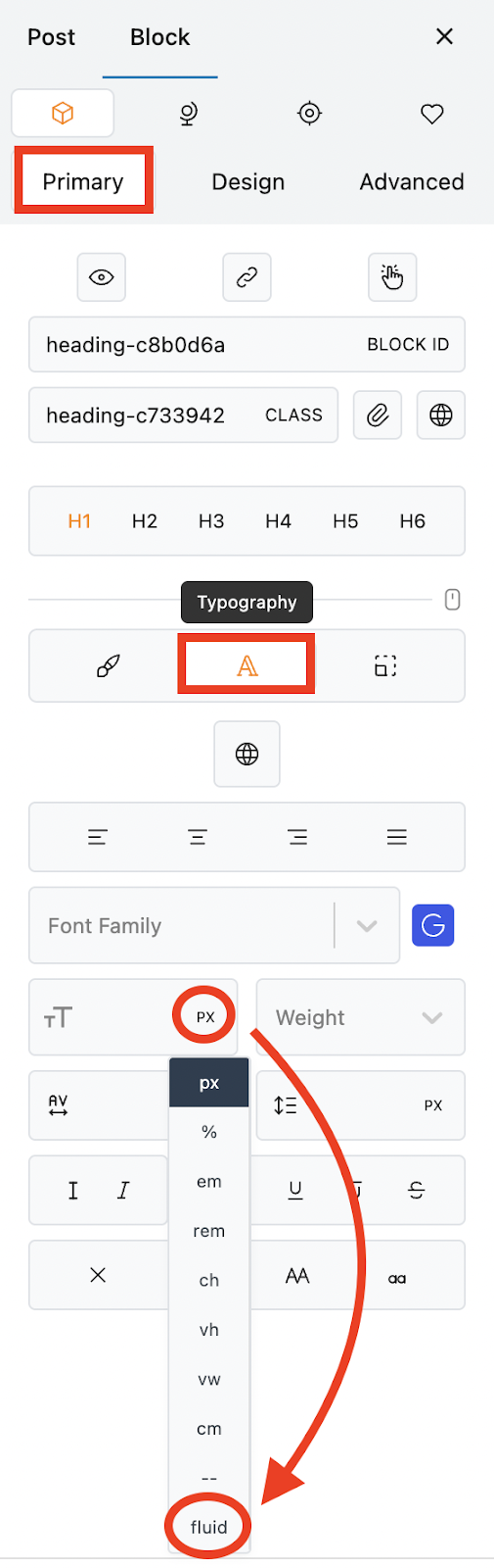
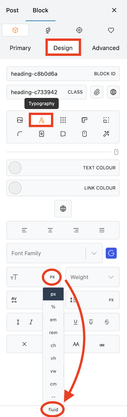
To access fluid typography, select a text block and navigate to the Primary or Design tab.

Open the Typography tab and find the font size property.

Click on the size value field to open the dropdown.&#x20;

Select Fluid Typography at the bottom.

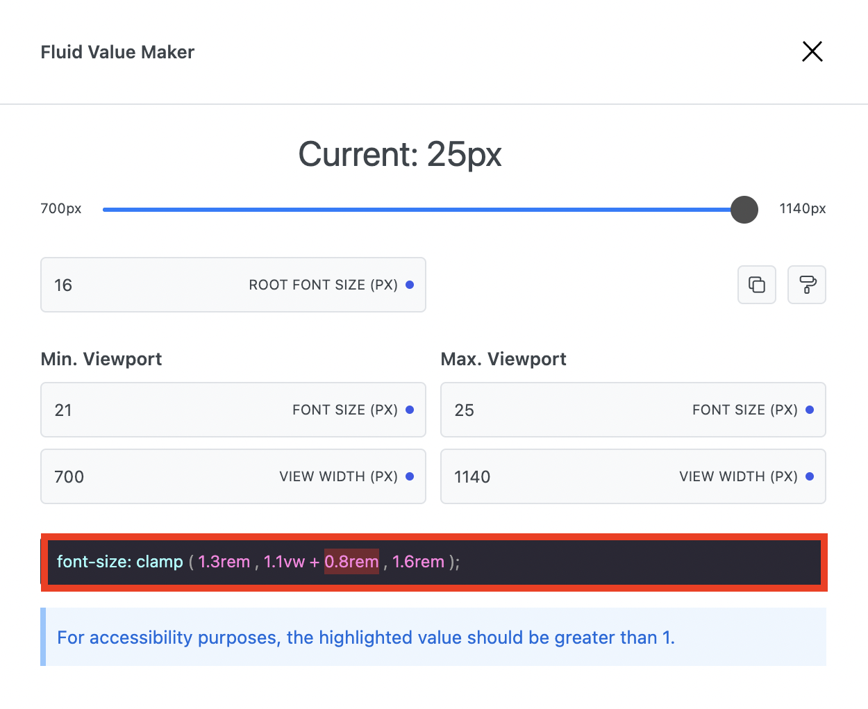
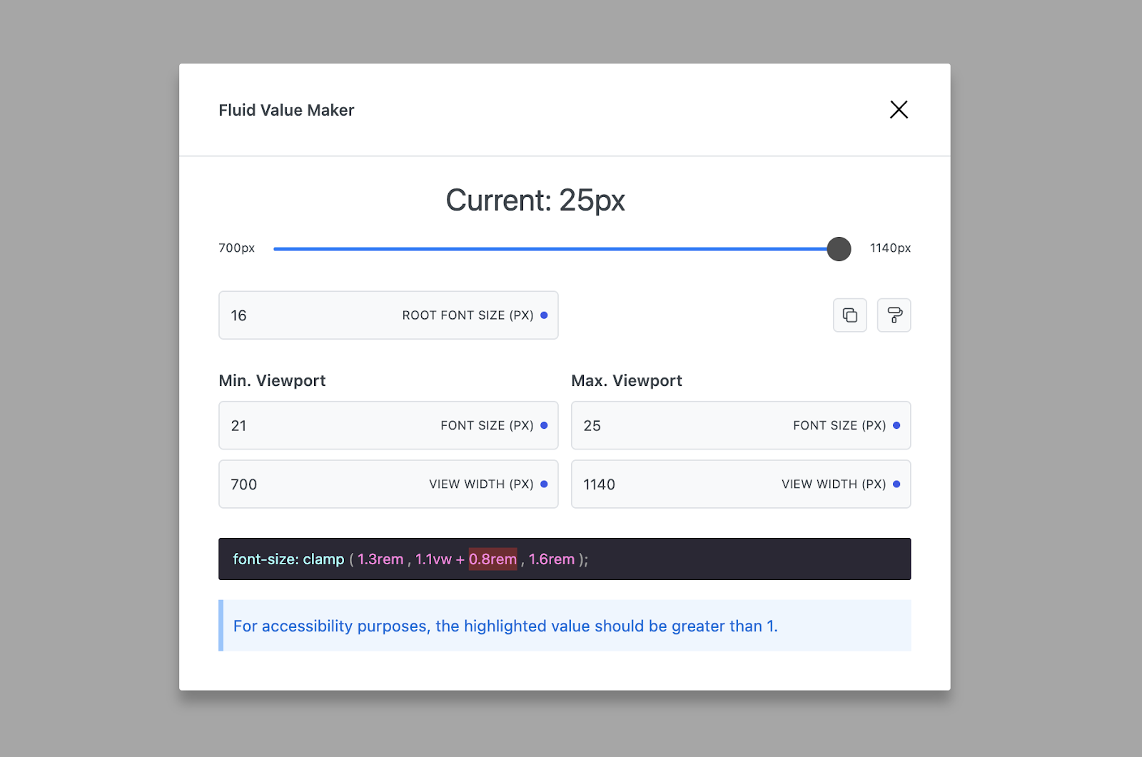
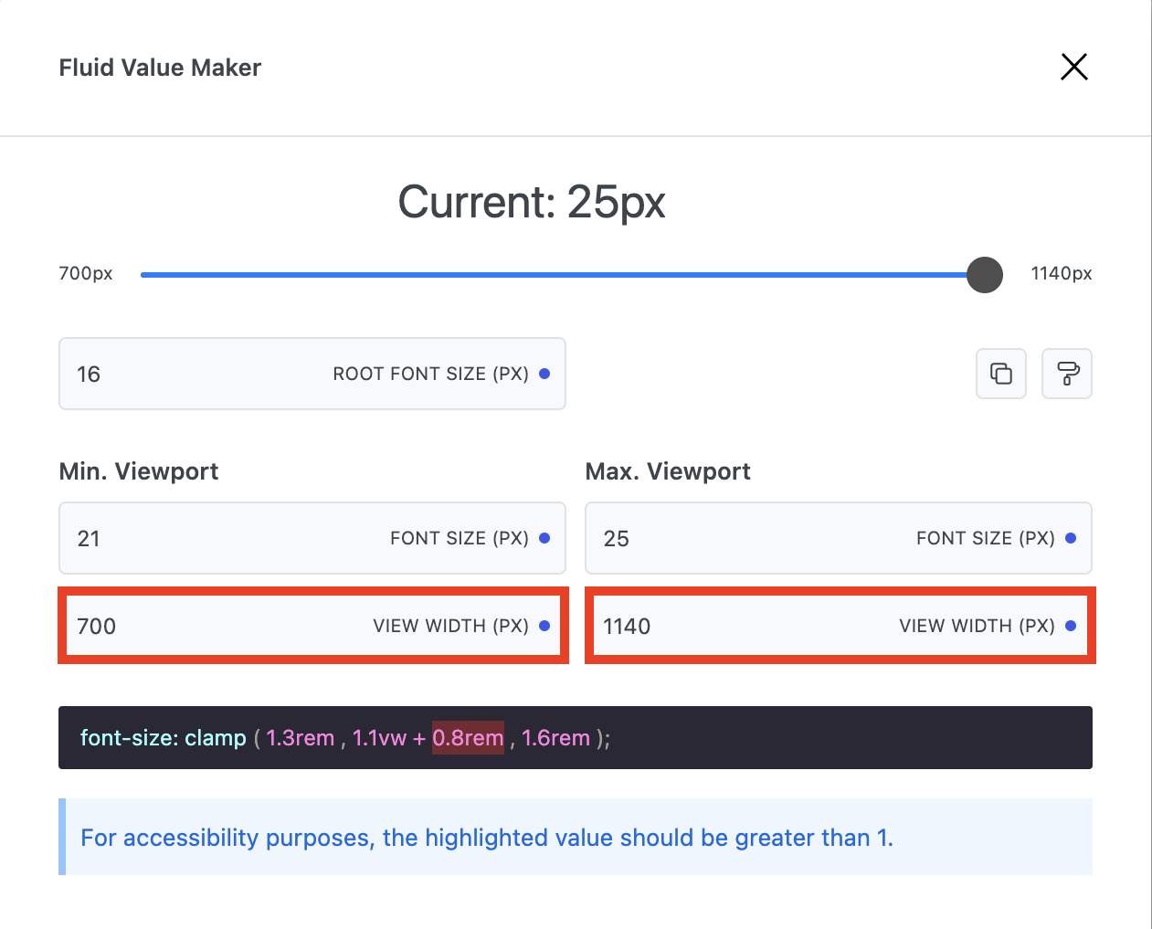
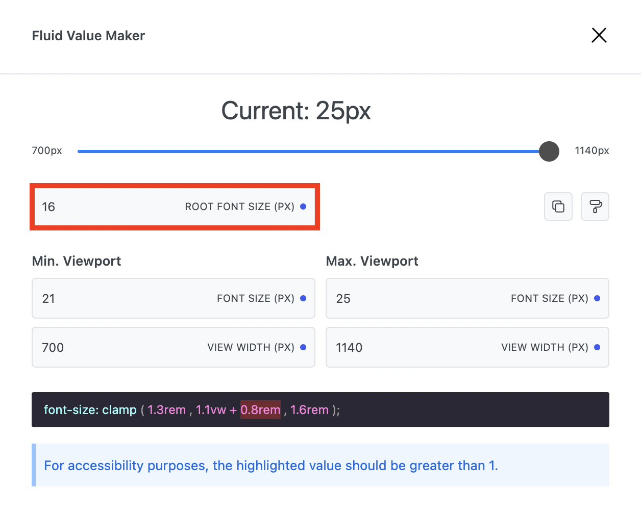
This will open a Fluid value Maker modal where you can adjust the maximum and minimum values for different browser sizes.
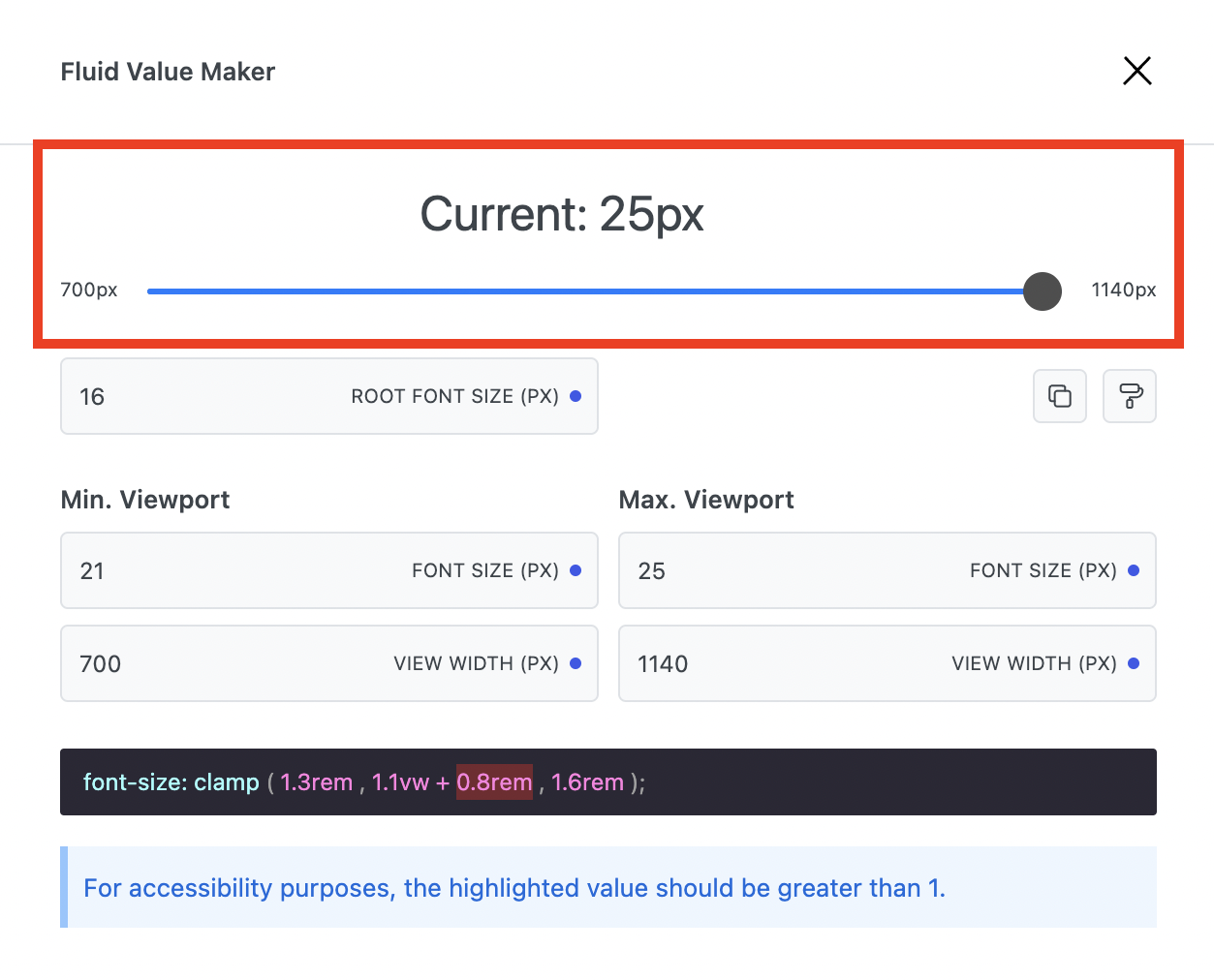
![](https://lh5.googleusercontent.com/tAAfhxADwiViV4IjkMPltg_ZEXrl7MMWWn6nwJwzSBQwAylJltRNXvieWWqHPC6t0szyNA_nhkLRc45k60gfTQPwB2Z9Bb-WMdHniMfdyjQnHiprDjE2kO57EzQRxkzi8lOYkV0gvBwuWb9GzMtr1IJiaPbrBKo1v4gK1qnh-ho9NaT2HmIY3bUc1hL0rw)     ![](https://lh6.googleusercontent.com/O4D37UmPhNCXBZSumX-gzlPWdd3HIjj23PeEN_l7QNZRHHfnP381eyMT5EKhq4hDrHSrC9nGUJx7PshXeSZeHfhjLMXdC5SaDx7Vm7JuucAf7xvmZ_mZyv1mlkzYavbnbsD_mVYmOuohX08d1qEKryaVFf2cF9RS8H8iRRN7paGgk-4Yt0JT7RNIswB7Cg)

### Current Preview

The Current property displays the typography size being used at the moment.

The slider underneath can be moved to show how the font size changes depending on the screen size within the limits that you set.

![](https://lh5.googleusercontent.com/GLmUV0MU0DgHjNQV-CUqdvtWhqg4MxECaCGOUE4c8N80YQh9uuQcB_h87BI_Zf4oATOofdDMRG5NKznruAmb0KH73LBIHphD294nGDPE40ojy0VvFvYvvTCSHGbtQGMGsSXD39aUHPGo7jO88CudqxgcDOqfS0dqyHxF2CGDMDYbA5m3BPdlZEQF8mdHyg)

### Root Font Size

The standard root font-size of browsers is 16px.

You can adjust this with caution as required.

![](https://lh4.googleusercontent.com/qg3SpztxQGfwltY0xYO_peqQPDEC2LZ-4JnKF8Q1v0kfLc6Wt7qCDLFtY_4-hMPCNjIFIy2ZyPE_iE5aYHsEgJ4KgdVHmGYjVU_NCA8RDloGlW0qgEoXNir8nD3GSEZZwzRw6jIBN7WfEAfD_bgd5SQVKEEs2eJVjd3oDLIzH77USD7dkIGY7AkUes-WCA)

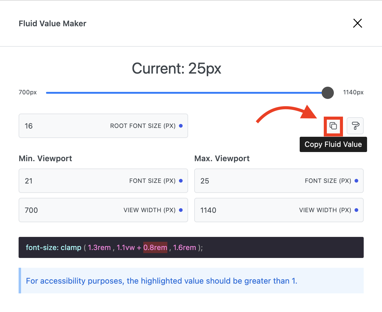
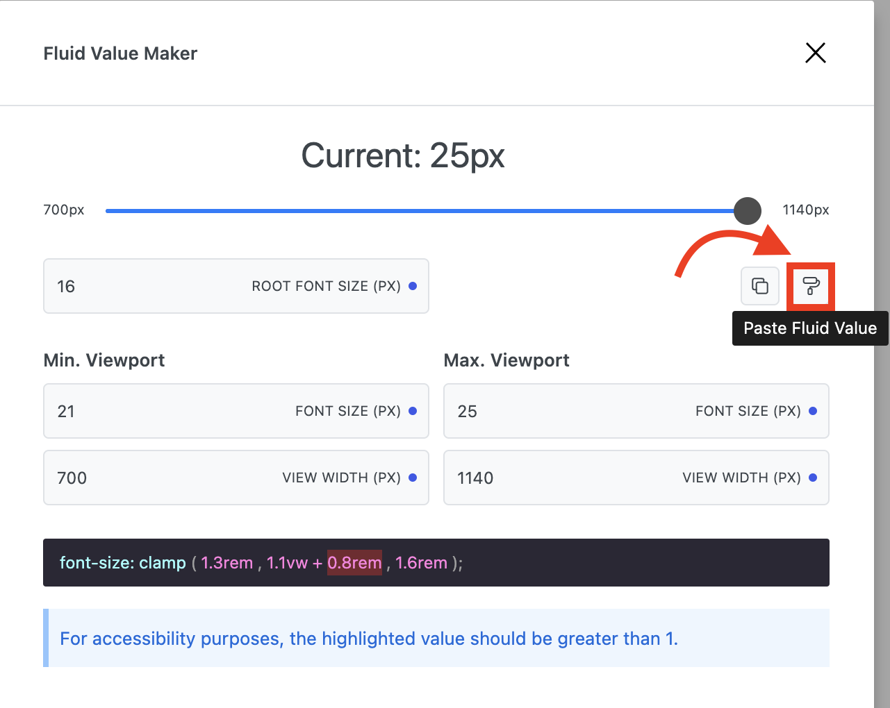
### Copy/Paste Fluid Value

The Copy and Paste properties allow you to copy the current configuration for use elsewhere.
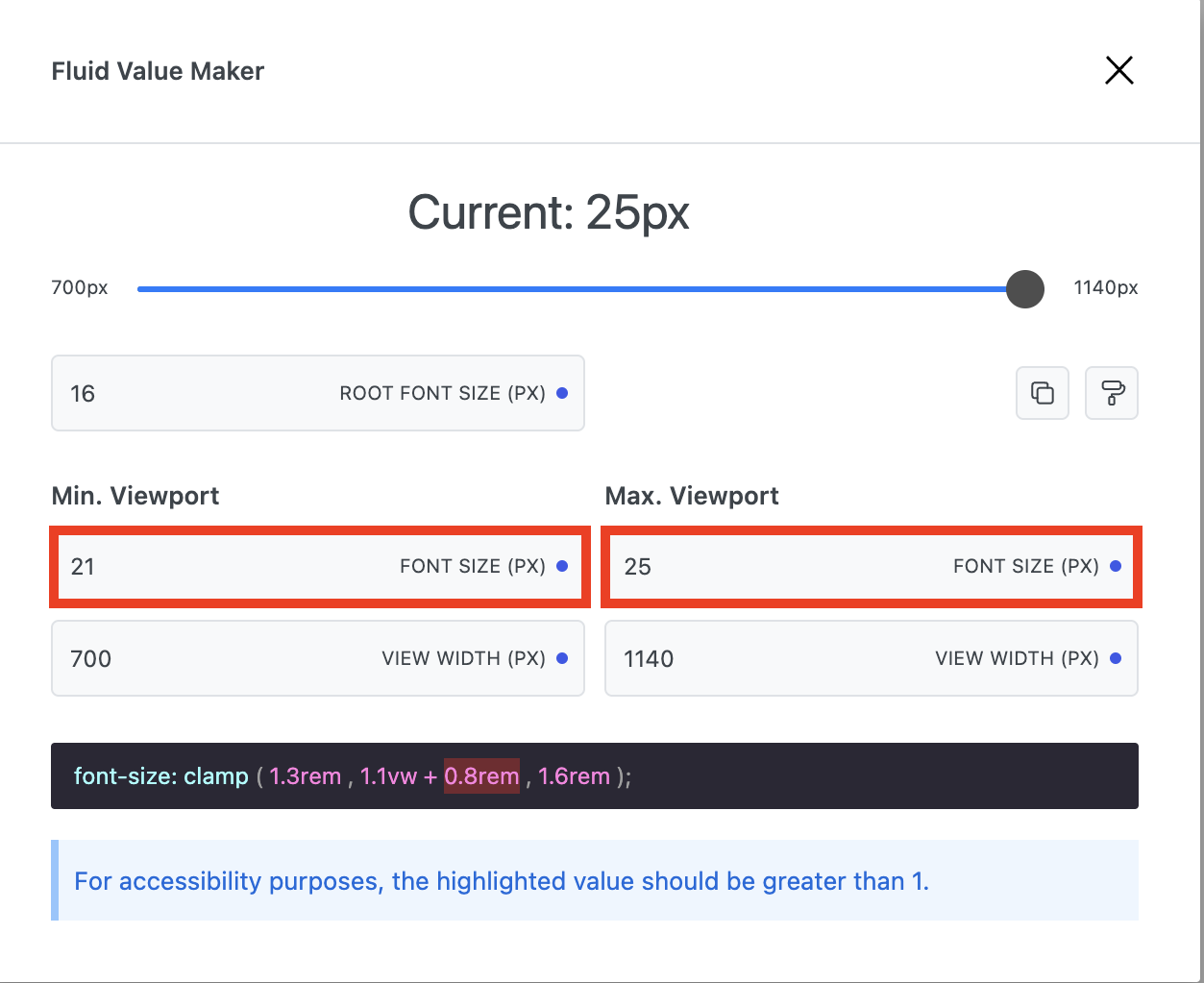
![](https://lh5.googleusercontent.com/aDUKSOCTyvO2STvVLP0HbzVec39qvpxjNwAgBGfet4oVDpX551TbBF3vDRiR8Bwe11xJZIJ54TnfBnDqhiH7yYf2Wb3BUw3dIvVzkEbNlRTkm4g15e9W5nhxuZU-1cQoIvXr4Qp9Ak1zQK1H2YEjWuT7GKMLx4yd28pExQYECt0RffM9OvnU1vg-ezo8_g)     ![](https://lh5.googleusercontent.com/hdrbXUQI1CFxsdKFxw8YvwPlwbKHbajX6DgYR7B_sxp5omLQP7FfFo2v54O2fjb0JM2oay0EGfjgAWZDkJaZDb-giE_ysg7gFn6jOSzDQjZyqRqzJMYLCCST0IAa1ejS58rihFj2rgjurSLDPhHo9_ZCR3f6toIf71NCllykZrEOFgfvZhxSM8aO3M3VOg)

### Font Size

Allows you to adjust the minimum and maximum font sizes for minimum and maximum viewports.

<figure><img src="https://lh3.googleusercontent.com/1erdAtCsYNuXZ0npKJ9nL1BoarKkvHRu5ZsZaNYfrI4U-nHGr7WvMJ8LXC-TkEvTh99r13N_nbHHAnItQWDSG41k6SKJJSpdlCHNuX-sY4cTraCghn3RID7wSAHS_lbIDwBggNYuz2Iu1t8Cg_c-AGEChGR2poouCiPCLtMd5hved7OjoOtXz6a6fI2VTg" alt=""><figcaption></figcaption></figure>

### View Width

Allows you to adjust the minimum and maximum view width for different viewports.
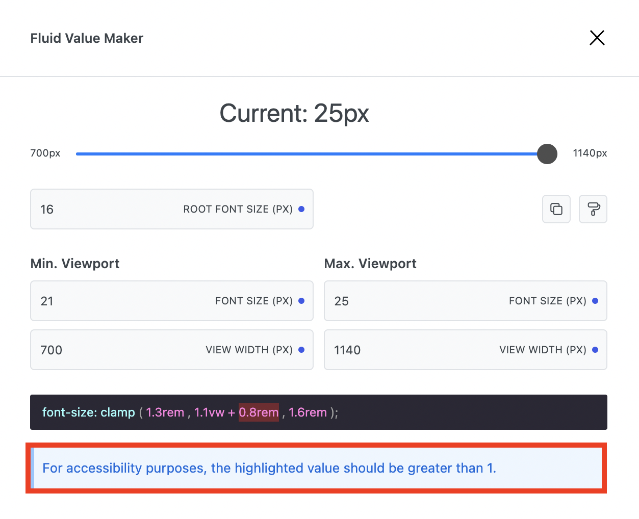
<figure><img src="https://lh3.googleusercontent.com/TsN-zN-p7Ba27KLj5zFeNo_7OlN2DxchUD8SmHT3bC-KD3vWTzzWkWkcJk9gMZEYqOfokNpbqoLh69gWe9odCvCamLRJ-NmGim_mDJP3tI4wnuwjiK6T6EMsgyI17CWYDrrkl9lO8F8gb9-JH88htKrBlYq_0D6j1__jdPdaTrRULVgp1QpnQD8nL3CN3A" alt=""><figcaption></figcaption></figure>

### Font-size Clamp

Generates a linear scale that allows you to set a font-size that grows with the size of the viewport, but doesn't go below a minimum font-size or above a maximum font-size.

There is also an accessibility reading that is highlighted and should be  greater than 1 for accessibility purposes.

![](https://lh5.googleusercontent.com/0d2esh921yqu078BPbdnXqnVknPn5dTi0gvGMIKQ1ibiD87lSNqOHIgWaDmNbmfHHU5xsZE-9gwFMUOo4TQpZGw-zua65A7Vbgd_emgzHswSHELYpOnhd1FPxPRqbSJw9XGtjMXFQYVv39TP-K7yuWPSjHTs9UR9S1p5yeeOaTAABDF1UwrOsWnmSRDD8A)     ![](https://lh5.googleusercontent.com/Kh6FfjGaBGUuhbrtESvjeBjZHZTzFP6PrWY7m-kgmt_TaE3Vu05tZNqpO9i5Gqi0g7VSShAoSM5TXS4cLcbziSv3kPUpyPNariLrWKKi--bA9s6aX8PFfsYBuk5DQUniAu_AucyGV1l2XyO14TRTFf9_-BDXwGB9yxI7B-uBgr48wOlIbZnbmSvBEnV-NQ)


---

# Agent Instructions: Querying This Documentation

If you need additional information that is not directly available in this page, you can query the documentation dynamically by asking a question.

Perform an HTTP GET request on the current page URL with the `ask` query parameter:

```
GET https://docs.cwicly.com/design/fluid-values.md?ask=<question>
```

The question should be specific, self-contained, and written in natural language.
The response will contain a direct answer to the question and relevant excerpts and sources from the documentation.

Use this mechanism when the answer is not explicitly present in the current page, you need clarification or additional context, or you want to retrieve related documentation sections.
